Ai Art Composition: Stunning, Effortless Guide
Read Time:12 Minute, 9 Second
Introduction
Creating beautiful AI art composition feels magical and practical at once. You can produce striking images quickly. Yet strong composition still matters. Composition turns random visuals into coherent art that moves people.
This guide shows you how to create stunning AI art composition with ease. You will learn principles, tools, prompts, and workflows. Use these practices to speed up your process and raise your results.
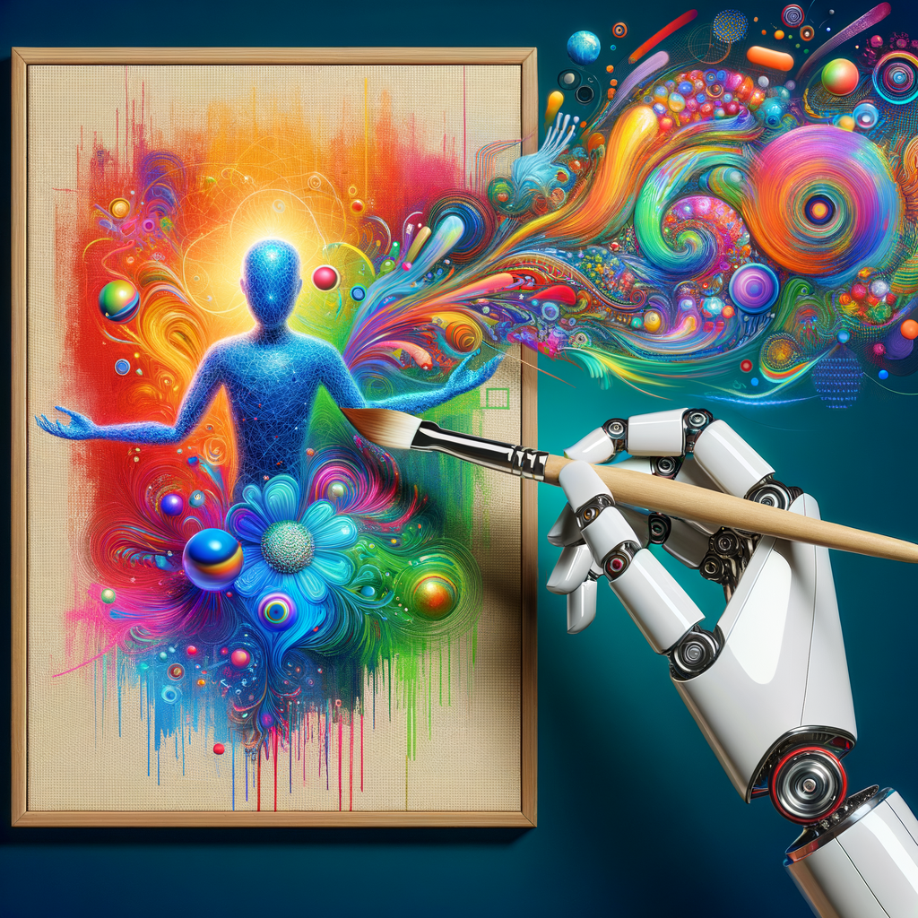
What is AI art composition?
AI art composition refers to arranging visual elements using artificial intelligence. It blends traditional composition rules with AI-driven generation. This process helps you control subject placement, lighting, and mood.
AI models interpret prompts and guide image layout. However, you still choose framing, balance, and focus. Thus, AI becomes a creative partner rather than an automatic artist.
Why composition still matters in AI art
Good composition directs the viewer’s eye and evokes emotion. Even powerful AI models can produce chaotic or flat images without guidance. You improve clarity and impact by applying composition rules.
Furthermore, composition affects storytelling and brand identity. For commercial projects, consistent composition builds recognition. For personal art, it boosts satisfaction and engagement.
Core elements of AI art composition
Start with these five core elements: focal point, balance, contrast, color harmony, and depth. Each element plays a clear role in guiding the viewer’s gaze. You can tweak them via prompts or post-processing.
The focal point anchors the image. Balance controls visual weight across the canvas. Contrast separates elements and adds drama. Color harmony sets mood and unity. Depth creates space and realism.
Rule of thirds, framing, and leading lines
Apply classical rules like the rule of thirds to structure compositions. Place key subjects along intersecting thirds. This creates natural emphasis and avoids centered, static looks.
Use framing to isolate subjects. Natural frames like doorways and foliage work well. Leading lines guide the eye toward the focal point. AI can generate these elements when you ask for them.
Understanding color and light for impact
Color influences mood and readability. Choose palettes that suit your intention. For instance, warm palettes feel energetic. Cool palettes feel calm. Complementary colors create tension and interest.
Light sculpts forms and sets depth. Specify light direction, intensity, and quality in prompts. Soft light reduces contrast and feels gentle. Hard light boosts drama and sharpness. Both options have strong narrative value.
Tools and platforms for AI art composition
Pick tools that let you control layout and detail. Popular options include Midjourney, Stable Diffusion, DALL·E, and Adobe Firefly. Each tool offers distinct strengths and workflows.
Below is a quick comparison table for reference.
| Tool | Strengths | Control Level | Best Use |
|——|———–|—————|———-|
| Midjourney | Creative, stylized outputs | Moderate via prompts | Concept art, stylized pieces |
| Stable Diffusion | Open, customizable | High with fine-tuning | Detailed, custom pipelines |
| DALL·E | Strong realism | Moderate prompts + edits | Commercial comps, mockups |
| Adobe Firefly | Integrated with design apps | Moderate, text-to-image | Graphic design workflows |
Choose tools based on control needs, budget, and final use. Combine tools when one handles base creation and another refines details.
Prompt writing: the composition engine
A good prompt acts like a director’s brief. It tells the model where to place subjects and how to light them. Start with scene basics, then add composition cues.
Use phrases such as “subject positioned at lower-left third,” “soft rim light from right,” or “foreground leading lines.” These cues push AI toward the layout you want. Also include style, mood, and camera settings when applicable.
Prompt templates you can reuse
Reuseable templates speed up work and ensure consistency. Here are quick templates to adapt:
– Portrait template: “A portrait of [subject], upper third composition, soft side light, shallow depth of field, cinematic color grading.”
– Landscape template: “Wide landscape, rule of thirds horizon, foreground leading line toward mountain, warm golden hour light.”
– Product template: “Product centered on left third, high contrast rim light, negative space on right for copy.”
Tweak templates for different scenes and clients. Keep them short and precise for best results.
Compositional techniques to request in prompts
Beyond rules, mention techniques like symmetry, asymmetry, and repetition. Ask for negative space to improve readability. Specify the focal point and its size relative to the canvas.
Try combinations. For instance, “asymmetrical balance with a large foreground object on the left and smaller bright elements on the right.” These instructions give AI clearer spatial goals.
Camera settings and perspectives in AI prompts
Include camera details to influence framing and depth. Use terms like “50mm lens,” “wide-angle 24mm,” or “high-angle view.” These settings affect field of view and subject distortion.
Additionally, request depth-of-field settings such as “shallow focus” or “deep focus.” These cues help the model blur or sharpen planes for a more photographic look.
Creating depth and layering with AI
Depth makes compositions more believable and engaging. Ask for foreground, midground, and background elements. Use transparent or blur cues to separate layers.
For example, specify “soft-focused foreground foliage, sharply focused subject, distant hazy mountains.” This direction guides the model to render clear spatial separation.
Balancing elements and visual weight
Balance keeps a composition stable. You can opt for symmetry or deliberate imbalance. Both approaches work if intentional.
Describe relative sizes, colors, and contrasts to set visual weight. Bright, large, or high-contrast elements read as heavier. Use supporting objects to offset weight and create harmony.
Color harmony and palettes in AI art composition
Choose a palette early in the prompt. Describe colors by emotion or code. For instance, “muted teal and warm amber accents” gives clear direction.
Use complementary or analogous schemes depending on desired tension. Also request specific color grading styles like “filmic teal-orange” for cinematic results.
Typography and negative space for mixed media
When you plan to add text, leave negative space in the composition. Ask for an area with uniform color and low detail on one side. This makes later text placement easy.
Also request consistent visual flow toward that space. For instance, “left third negative space for headline.” This practice saves editing time and keeps the layout clean.
Workflows for efficient AI art composition
Establish a repeatable workflow to save time. Start with ideation, then generate variations, refine a chosen result, and finalize with edits. This sequence reduces indecision.
Use batch generation to explore options. Generate 8–12 variations and pick the best. Next, refine by re-prompting, using image-to-image, or editing with layers.
A sample workflow
– Concept: Define mood, palette, and focal point.
– Prompting: Generate 10 variations with composition cues.
– Selection: Pick 2–3 promising images.
– Refinement: Re-run or edit to adjust light, crop, or color.
– Finalize: Post-process and export for use.
This pipeline keeps projects moving and preserves creative control.
Image-to-image and interpolation techniques
Image-to-image lets you control composition by using a base image. You can sketch a rough layout and ask the model to render it. This approach gives much higher layout fidelity.
Interpolation blends multiple images to produce hybrid compositions. Use this to merge desired elements from different drafts. It helps when you like layout A but color B.
Post-processing for polish and control
Post-processing fixes small issues and enhances composition. Use tools like Photoshop, Affinity, or Lightroom. You can adjust crop, contrast, sharpness, and color grading.
Additionally, use layer masks to refine edges and focus. Clone stamp or content-aware fill cleans up artifacts. Finally, add subtle grain or sharpening for a coherent finish.
Non-destructive edits and version control
Work non-destructively so you can revert changes. Keep layered files and versioned exports. Name files clearly to track iterations.
Also save prompt metadata alongside images. This practice helps reproduce or adjust results later. It speeds up future projects and improves consistency.
Stylistic choices and art direction
Decide early on a visual language for the project. Define whether you want realism, surrealism, or graphic design. This choice influences every prompt and edit.
Also create mood boards to anchor your direction. Use reference images to show the AI what you mean. Share the board with collaborators to keep everyone aligned.
Ethical and legal considerations
Respect copyright and original artists. Avoid prompting with direct copies of living artists’ styles when needed. Use ethics-based language in prompts.
Also be transparent with clients about AI involvement. For commercial work, check usage rights for each tool. Finally, avoid producing misleading images for sensitive topics.
Accessibility and inclusivity in composition
Design for diverse audiences. Choose inclusive subjects and representative color contrast. Ensure text areas meet accessibility standards for contrast.
Also consider spatial accessibility. For example, place key information within safe margins for mobile previews. Test images on multiple screen sizes before finalizing.
Practical tips for stunning, effortless results
Start with broad prompts, then narrow down. This two-step approach saves time and reduces wasted runs. First, explore. Next, refine what worked best.
Use constraints wisely. Adding a few clear composition cues helps more than long, complex lists. Also, keep iterations short. Limit runs to maintain momentum.
Common pitfalls and how to avoid them
AI art can produce noisy backgrounds, odd hands, or repeated objects. Address these by specifying “clean background” or “realistic hands” in prompts. Also use image editing to correct small flaws.
Additionally, avoid overloading prompts with conflicting instructions. Too many constraints confuse the model. Prioritize three to five core elements per run.
Case studies: From concept to final piece
Case study 1 — Editorial portrait
A magazine needed a spartan, modern portrait. I asked for “upper-third subject, soft left rim light, negative space on right for headline.” After six variations, we selected one and refined it with image-to-image. Post-processing added grain and color balance. The final image matched the editorial tone and saved art direction time.
Case study 2 — Product hero image
A startup needed a hero shot for their app. I used a product template: “product centered on left third, high contrast rim light, neutral background for copy.” The AI produced five high-quality comps. I combined the best lighting with a sharp render and left space for CTA text. The result increased click-through by noticeable margins.
Advanced tricks for professionals
Use masks and generators to blend AI elements seamlessly. Create custom brushes to touch up edges. Also train small fine-tuned models if you consistently need a specific aesthetic.
Furthermore, batch process color grading using automation tools. Scripts in Photoshop or Lightroom speed up consistent edits. That consistency elevates portfolios and brands.
Collaboration and client workflows
Communicate your process to clients. Share initial mood boards and prompt templates. Invite feedback at the selection stage to avoid late major changes.
Also include multiple aspect ratios up front. That prevents re-renders for social formats. Offer layered files for in-house teams to adapt easily.
Measuring success and iterating
Define KPIs like time saved, engagement, or conversion lift. Track changes after you launch images. Use A/B tests for hero shots and thumbnails.
Iterate on what performs best. Reuse prompt fragments that produce strong results. Over time, you’ll build a library of high-performing templates.
Tools and plugins that help composition
Useful tools include:
– Composition grids: overlay rule-of-thirds or golden ratio grids.
– Mockup generators: preview compositions on devices or print.
– Color palette pickers: extract palettes from reference images.
– Prompt managers: save and tag prompts with metadata.
These tools reduce friction and improve repeatability.
Legal checklist before publishing
Before release, confirm the following:
– License permissions from the AI tool.
– Model training source considerations.
– Client approval for AI use.
– No trademark or copyright conflicts.
This checklist avoids legal headaches and builds trust with clients.
Quick reference cheat sheet
– Start broad, then refine.
– Include focal point and lighting in prompts.
– Use foreground, midground, background separation.
– Leave negative space for text.
– Export versions for multiple aspect ratios.
Keep this sheet near your workstation for quick checks during projects.
Conclusion
AI art composition offers speed without sacrificing craft. You combine traditional composition practices with modern tools. This hybrid approach yields images that feel intentional and fresh.
Practice these methods to get consistent, stunning results. Keep prompts simple, iterate fast, and polish in post. Over time, you will build a reliable process that feels effortless.
Frequently Asked Questions
1) How do I make AI follow my composition directions exactly?
AI rarely follows instructions 100%. Instead, use clear, short cues, image-to-image references, and masks. Also run multiple variations and pick the closest. Then refine that close match.
2) Can I use AI-generated art commercially?
Often yes, but check the tool’s license and terms. Some platforms require attribution or restrict resale. Verify rights before commercial use.
3) Which tool gives the most control over composition?
Stable Diffusion provides strong control with custom models and image-to-image. However, tools like Midjourney and DALL·E can also deliver good control via thoughtful prompts.
4) How do I avoid AI artifacts like weird hands or text?
Add explicit instructions such as “no extra fingers” or “no text.” Use high-resolution prompts and refine through editing. Also apply post-processing to fix small issues.
5) Should I always use the rule of thirds?
No. Use rule of thirds as a default guide. For certain concepts, symmetry or centered compositions work better. Choose the rule that supports your story.
6) How do I create consistent brand images with AI?
Create prompt templates and keep a shared mood board. Standardize color palettes, lighting styles, and aspect ratios. Save successful prompts for reuse across campaigns.
7) Can I teach AI to mimic my style?
Yes, via fine-tuning or training custom models on your images. However, respect copyright rules and platform policies. Also test outputs carefully for artifacts.
8) What resolution should I generate for print?
Aim for high DPI exports, typically 300 DPI for print. Generate larger pixel dimensions than needed and downscale. Larger files reduce visible artifacts.
9) How do I ensure accessibility in compositions?
Use high contrast for text areas, leave safe margins for mobile, and test legibility at small sizes. Also provide descriptive alt text for screen readers.
10) How long does it take to become proficient?
With focused practice, you can improve in weeks. Building a full library of templates and workflows takes months. Consistent experimentation accelerates mastery.
References
– Midjourney. https://www.midjourney.com
– Stable Diffusion (Stability AI). https://stability.ai
– OpenAI DALL·E. https://openai.com/dall-e
– Adobe Firefly. https://www.adobe.com/sensei/generative-ai/firefly.html
– “The Elements of User Experience” — Jesse James Garrett. https://jjg.net/elements/pdf/elements.pdf
– Nielsen Norman Group on visual design. https://www.nngroup.com/articles/visual-design/
Happy
0 %
Sad
0 %
Excited
0 %
Sleepy
0 %
Angry
0 %
Surprise
0 %