AI-Generated Color Trends: Stunning Picks For 2023
Read Time:8 Minute, 40 Second
- Understanding AI and Color Trends
- The Science Behind AI-Generated Colors
- Stunning Color Trends for 2023
- 1. Warm Earth Tones
- 2. Vibrant Blues
- 3. Soft Pastels
- 4. Rich Jewel Tones
- 5. Dynamic Neutrals
- How to Use AI-Generated Color Trends in Your Design Projects
- 1. Explore Color Palettes
- 2. Stay Updated
- 3. Test and Adapt
- Color Psychology in Design
- Exploring Additional AI Color Tools
- 1. Adobe Color
- 2. Colormind
- 3. Paletton
- Adapting to Cultural Influences
- Conclusion: Embracing the Future of Color
- FAQs
- References
Understanding AI and Color Trends
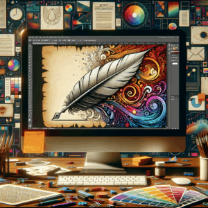
Artificial intelligence (AI) has revolutionized numerous fields, and the world of design is no exception. By analyzing vast data sets, AI can predict trends ahead of human intuition. In the realm of color, this technology effectively identifies shades that resonate with audiences. For 2023, AI-generated color trends shine a spotlight on captivating hues that promise to influence various design sectors.
As we explore these trends, we’ll focus on how AI identifies colors, what’s trending this year, and how you can use these insights in your design projects. Using color correctly can elevate your brand, communicate emotions, and set a mood that resonates with your audience. Therefore, understanding these trends is crucial for anyone in the creative space.
The Science Behind AI-Generated Colors
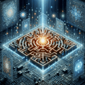
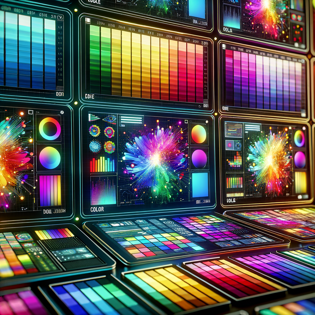
AI leverages algorithms to sift through enormous amounts of visual data. It analyzes images, videos, and social media content, identifying popular colors and their combinations. This analysis considers various factors, including seasonal influences, cultural shifts, and consumer preferences. By synthesizing this information, AI can generate color trends that reflect what resonates with society.
One key advantage of AI in color selection is pattern recognition. The algorithms can detect subtle shifts in color usage over time. For instance, a color that was popular a few years ago may resurface in new contexts or combinations. AI doesn’t just stop at identifying colors; it also suggests complementary hues that work well together. This feature is particularly beneficial for designers looking to create visually cohesive palettes.
Stunning Color Trends for 2023
This year, a mix of bold and muted colors fills the palette. AI predictions spotlight shades that reflect optimism and vitality. Below are some of the standout hues set to dominate in various design sectors, including fashion, interior design, and graphic design.
1. Warm Earth Tones
Warm earth tones offer comfort and a sense of security. Colors like terracotta and muted taupe create cozy atmospheres. They work well in home design and fashion alike, providing a welcoming feeling. These shades also evoke a connection to nature, which many seek in an increasingly digital world.
In addition, these colors are versatile. Use them as base shades for a room, or combine them with bolder colors for accents. Pair terracotta with olive green or creamy white for a modern twist on a classic scheme.
2. Vibrant Blues
Bright, vibrant blues symbolize trust and dependability. Shades like azure and cobalt are set to dominate in 2023. These colors ignite creativity and energy, making them ideal for branding and marketing materials. Not only do they influence behavior, but they also capture attention effectively.
When used strategically, vibrant blues can bring life to your design projects. For instance, in web design, these shades can lead visitors’ eyes to important information. Consider using them in call-to-action buttons or headings to create a strong visual impact.
3. Soft Pastels
Soft pastels are making a comeback in 2023. Colors like blush pink, light lavender, and soft mint are perfect for creating peaceful, inviting spaces. These hues encourage calmness and can enhance well-being. Interiors adorned with pastels foster relaxation, making them suitable for wellness spaces and homes.
Furthermore, pastel colors offer immense flexibility. You can pair them with darker shades for contrast or use them within a monochromatic scheme for a soothing effect. Think about incorporating soft pastels into your branding to evoke a sense of serenity.
4. Rich Jewel Tones
Jewel tones—like emerald green, ruby red, and sapphire blue—express luxury and sophistication. These colors are strong, bold, and perfect for making a statement. In fashion, they are often featured prominently in evening wear, while in interiors, they can add drama and elegance.
When using jewel tones, balance is key. Pair them with neutral colors to prevent overwhelming a space. Jewel tones can also stand alone as accent colors in your design projects. This approach allows them to shine while maintaining a cohesive look.
5. Dynamic Neutrals
Dynamic neutrals, such as taupe, greige, and muted gray, bring versatility to the table. Unlike traditional neutrals, these shades add character to any space. They serve as an excellent backdrop for more vibrant colors or can be stand-alone options.
Using dynamic neutrals effectively can open up creative possibilities. They work well in minimalist designs, allowing other colors or elements to take center stage. In branding, these shades convey professionalism without being too stark.
How to Use AI-Generated Color Trends in Your Design Projects
Integrating AI-generated color trends into your work can dramatically enhance your designs. Here are some practical tips to get you started:
1. Explore Color Palettes
Start by researching the latest AI-generated color palettes. Tools like Canva, Adobe Color, and Coolors can help you visualize these color combinations. Once you have an idea of what resonates with your target audience, experiment with different combinations.
You can create mood boards to see how different colors work together. This exercise is also beneficial for understanding how colors interact in various lighting conditions.
2. Stay Updated
Color trends are ever-evolving. Keep an eye on design blog posts, social media, and even Pinterest to see what’s trending. Follow influencers in your industry or color experts for real-time updates and inspiration. This vigilance helps you remain relevant and informed.
Attending design conferences or webinars can also provide insights into emerging trends. Networking with other professionals can spark creativity and encourage collaboration.
3. Test and Adapt
When working on a design project, don’t hesitate to test different colors. Use A/B testing for digital campaigns to see which colors perform better with your audience. Collect feedback and adapt your strategies accordingly.
Additionally, consider creating seasonal collections based on color trends. This approach can keep your work fresh and appealing. Analyzing audience preferences over time will help you refine your color choices.
Color Psychology in Design
Understanding color psychology will enhance your design decisions. Each color evokes specific emotions and associations. Here’s a quick overview of the psychology behind some popular colors:
| Color | Emotion/Association |
|—————|—————————–|
| Red | Passion, energy, urgency |
| Blue | Trust, calmness, stability |
| Yellow | Happiness, optimism |
| Green | Growth, nature, healing |
| Purple | Creativity, luxury |
| Orange | Enthusiasm, warmth |
| Black | Elegance, authority |
| White | Purity, simplicity |
Using this understanding, you can choose colors that align with your brand message and audience preferences. For instance, if you want to evoke a sense of trust, incorporating blues into your branding will be effective.
Exploring Additional AI Color Tools
In the quest for the perfect color palette, several AI-driven tools can aid designers. Here are some well-regarded options:
1. Adobe Color
Adobe Color allows users to create and explore color themes. With features like color wheel adjustments and trending palettes, it helps to bring your ideas to life. You can also explore color combinations that other designers favor.
2. Colormind
Colormind is an AI-powered color scheme generator. It learns from images and design trends to suggest colors that work harmoniously together. Simply upload an image, and Colormind will generate complementary color palettes.
3. Paletton
Paletton uses color wheels to offer combinations suited to your preferences. It’s great for users seeking controlling color ratios and assessing how colors interact within a project. This tool excels in helping you create visually appealing designs.
Adapting to Cultural Influences
Color trends can also shift based on cultural influences and global events. In 2023, consider how these external factors might affect color choices. For example, hues that reflect hope and resilience are likely to gain popularity, given current global challenges.
By staying attuned to cultural and social movements, you can refine your color selections to be both aesthetically pleasing and culturally relevant. This awareness will enhance your ability to connect with audiences on a more profound level.
Conclusion: Embracing the Future of Color
AI-generated color trends offer a window into the future of design. By harnessing these insights, you can create vibrant, impactful projects that resonate with audiences. Staying informed about trends helps you maintain relevance in a constantly evolving field.
Embrace the power of AI in your color selection process and watch your designs flourish. The palette for 2023 is diverse and dynamic, inviting you to experiment, adapt, and grow creatively.
FAQs
1. What is AI-generated color trend analysis?
AI analyzes vast datasets to identify colors and combinations that are trending, often predicting their future popularity.
2. How can I incorporate AI color trends into my design?
Use color palette tools, follow design blogs, and consider audience preferences based on color psychology.
3. Are warm earth tones still in style for 2023?
Yes, warm earth tones, such as terracotta, continue to gain popularity for their comfort and connection to nature.
4. How do vibrant blues affect consumer behavior?
Vibrant blues symbolize trust and dependability, making them effective in branding and marketing materials.
5. Can I mix pastels with bolder colors?
Absolutely! Pairing soft pastels with bolder shades can create an engaging visual contrast.
6. What are some good AI color palette tools?
Tools like Adobe Color, Colormind, and Paletton offer robust features for creating and exploring color combinations.
7. How can I effectively test color choices?
Use A/B testing in digital campaigns to see which colors resonate better with your target audience.
8. What role does color psychology play in design?
Color psychology helps you choose hues that communicate specific emotions and associations, enhancing your brand’s message.
9. Are jewel tones suitable for all design types?
Jewel tones work best in contexts where you want to convey luxury and sophistication, like fashion and interiors.
10. How do cultural influences affect color trends?
Cultural and social factors can shift color preferences, making certain shades more relevant at specific times.
—
References
1. Leung, K. (2022). The Impact of Color Trends on Branding. UX Collective. Read More
2. Smith, A. (2023). Color Psychology in Marketing: How to Select the Right Color for Your Brand. HubSpot. Read More
3. Patel, S. (2023). AI in Design: The Future of Color Selection. Creative Bloq. Read More
4. Johnson, L. (2022). Understanding Color Theory for Designers. Canva. Read More
Happy
0 %
Sad
0 %
Excited
0 %
Sleepy
0 %
Angry
0 %
Surprise
0 %